If you’ve ever stood in a paint aisle holding two sample cards, wondering whether you’re about to make your living room look like a boutique hotel or a preschool classroom, you’re not alone. Accent walls are one of those design moves that everyone has an opinion about — your neighbor loves theirs, your sister-in-law thinks they’re a relic of 2014, and your contractor just wants to know which wall so he can tape it off.
I’ve spent years working around homes, renovations, and design projects, and I can tell you the truth nobody puts in the headline: an accent wall isn’t a trend, it’s a tool. Used well, it fixes a room. Used badly, it just draws attention to a problem you didn’t know you had. This guide walks through what an accent wall actually is, how to choose the right one, which colors work, and why some rooms should probably skip the idea entirely.
What Is an Accent Wall?
An accent wall — sometimes called a feature wall — is a single wall in a room that’s treated differently from the others. Usually that means a bolder paint color, a bold wallpaper, wood paneling, brick, or even a textured plaster finish. The rest of the room stays neutral so that one wall becomes the visual anchor.
The accent wall meaning in practical terms is simple: it’s a controlled dose of drama. Instead of painting an entire room a saturated color (which can feel overwhelming or make a small space feel smaller), you concentrate that color, pattern, or material on one plane. Your eye lands there first, then relaxes into the rest of the room.
People often ask, “what is a feature wall” as if it’s different from an accent wall — it isn’t, really. “Feature wall” is more common in UK and Australian design language, while “accent wall” is the term used more often in the US. Same concept, same purpose: create a focal point.
Why Designers Still Use Accent Walls (And Why the “Outdated” Debate Exists)
Here’s where I’ll push back on something you’ve probably read elsewhere. The question “are accent walls outdated” gets typed into Google constantly, and the honest answer is: the bad version of accent walls is outdated, not the concept itself.
What went out of style was the specific execution that dominated the 2010s — a single wall painted a deep red or a busy floral wallpaper, often chosen almost at random, usually the wall behind the TV because that’s just where people default to. That version does feel dated now, the same way exposed brick veneer panels or “Tuscan” faux-finish walls feel dated.
What replaced it isn’t the absence of accent walls — it’s smarter accent walls. Interior designers today still use them constantly, they just apply them with more intention:
- Tonal, layered color instead of one jarring contrast color
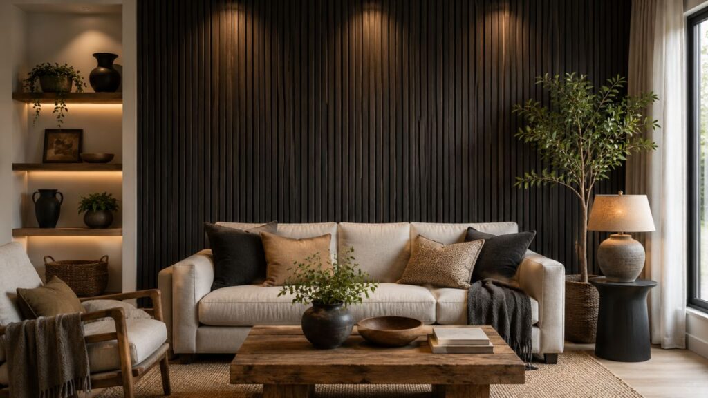
- Natural materials like wood slats, limewash, or stone instead of paint alone
- Accent walls that follow architecture (a fireplace, an alcove, a bed wall) instead of being chosen arbitrarily
- Softer, more sophisticated colors — deep greens, warm terracottas, muted blues — instead of primary-color statements
So if you’re worried accent walls will feel dated the moment you finish painting, the fix isn’t avoiding them. It’s choosing the wall and color with more care than “whichever one has the least furniture in front of it.”
Which Wall Should Be the Accent Wall?
This is genuinely the most common question I get, and it matters more than color choice. Get the wall wrong and even the perfect color won’t save the room.
Key Rules for Wall Selection
A few rules of thumb that hold up in practice:
1. Pick the wall your eye naturally goes to first.
Stand in the doorway of the room. Whichever wall you look at first — usually the one directly opposite the entrance — is typically your best candidate. That’s the wall doing the visual work anyway, so let it earn its keep.
2. Use architecture as your guide.
A wall with a fireplace, a built-in bookshelf, a bay window, or a headboard nook is almost always a better choice than a flat, featureless wall. The architecture gives the color a reason to be there.
3. Avoid the wall with the most doors or windows.
Paint gets visually chopped up by doorways, closet doors, and window trim. A wall interrupted by three openings won’t read as a bold, clean statement — it’ll read as fragmented.
4. In a living room, the sofa wall or the wall behind the TV are common defaults — but not always the best.
Painting the wall behind the TV can actually work against you, since a black screen against a bold color competes for attention. Some designers now prefer accenting the wall the sofa sits against, so the color frames the room from the seating perspective instead of confronting it.
5. In a bedroom, the headboard wall almost always wins.
It’s the wall you see most, it has a natural focal object (the bed), and it doesn’t require rearranging furniture.
If you’re still torn, this is a good gut check: pick the wall that, if you painted it and hated it, would be the cheapest and fastest to undo. That’s usually the wall without built-ins or trim you’d have to work around.
Accent Wall Colors: What Actually Works
Color is where most of the “accent wall paint ideas” searches lead people astray, because Pinterest boards show finished, styled rooms with perfect lighting — not the reality of your actual wall at 3pm with your actual lamp.
Here’s a more grounded way to think about accent wall colors:
Warm, Grounding Tones
Terracotta, clay, rust, and warm ochre have become the default recommendation for living rooms and dining rooms in the past few years, especially paired with warm wood tones and brass fixtures. They photograph beautifully but also hold up in daylight, which matters more than photographs do.
Deep, Moody Greens
Hunter green, olive, and forest green work almost everywhere — bedrooms, home offices, even kitchens as a lower-cabinet or island color. Green reads as sophisticated rather than trendy because it’s closely tied to natural materials, so it ages better than a saturated jewel tone.
Soft, Muted Blues
Navy and slate blue remain reliable, particularly in bedrooms, because blue has a genuinely calming physiological effect that’s well documented in color psychology research. It’s one of the few “loud” colors that still reads as restful.
Warm Neutrals and Greige
Not every accent wall needs to be a bold color. A slightly warmer or slightly darker neutral than the rest of the room — think a warm taupe against a cooler white — creates a subtle accent wall that reads as intentional without shouting.
Black or Charcoal
This is the one people are most afraid of and the one that most consistently surprises them. A matte black or deep charcoal accent wall in a room with good natural light and warm wood tones tends to look expensive and grounding rather than heavy. It works especially well as a backdrop for gallery walls or open shelving.
H3: Room-Specific Color Recommendations
A quick comparison table, since color choice really does depend on the room:
| Room Type | Strong Color Choices | Colors to Use Carefully |
|---|---|---|
| Living Room | Terracotta, olive green, warm charcoal | Bright primary colors, very dark navy (can feel cave-like without good lighting) |
| Bedroom | Navy, sage, dusty rose, warm taupe | Very saturated red or orange (can disrupt sleep-friendly calm) |
| Home Office | Forest green, deep blue, warm gray | Bright yellow or orange (can feel overstimulating for focus) |
| Dining Room | Deep red, burgundy, terracotta | Pale pastels (tend to read as flat under evening lighting) |
| Kids’ Room | Soft blues, muted greens, warm yellows | Very dark or moody colors (can feel oppressive in a small space) |
| Nursery | Sage, blush, soft warm neutrals | Highly saturated colors (better for older kids’ rooms) |
How to Choose an Accent Wall: A Step-by-Step Approach
If you want a repeatable process rather than guesswork, this is roughly what a designer walks through:
- Identify the room’s fixed elements first. Flooring, countertops, existing tile, and any furniture you’re keeping. Your color has to work with what’s already there, not the other way around.
- Choose the wall based on architecture and sightlines, using the guidance above.
- Pull three color options, not one. Committing to the first color you like is how buyer’s remorse happens. Compare a warm option, a cool option, and a neutral option side by side.
- Test large swatches, not paint chips. Paint a 2-foot by 2-foot section (or use a peel-and-stick sample) and view it at different times of day. Morning light, midday, and evening lamp light can make the same color look like three different colors.
- Consider the ceiling and trim before finalizing. More on this below, because it changes the whole equation.
- Sit with it for at least 48 hours before buying gallons. Color decisions made in a single afternoon are the ones people repaint within a year.
This process is slower than picking off a swatch card, but it’s the difference between an accent wall you still like in three years and one you’re covering up by next spring.
Accent Wall and Ceiling: Should the Ceiling Match?
This is a question that trips up a lot of people, and it’s more nuanced than most guides let on. When you’re deciding on an accent wall and ceiling combination, you’re really choosing between three approaches:
Option 1: Ceiling stays white or matches the trim.
This is the safest, most classic choice. The wall gets the drama, the ceiling stays quiet, and the room reads as more traditional.
Option 2: Ceiling accent wall — the ceiling becomes the accent instead of a wall.
A ceiling accent wall (also called a “fifth wall” treatment) paints or wallpapers the ceiling in a bold color or pattern while the walls stay neutral. This works particularly well in dining rooms, powder rooms, and bedrooms with lower ceilings, where it draws the eye up and can actually make a room feel taller if done with the right color intensity.
Option 3: Accent wall ceiling continuation — wrapping the color from wall to ceiling.
This is the technique behind a lot of the moody, cocoon-like rooms you see in design magazines right now. The accent wall ceiling paint continues from the wall directly onto the ceiling, blurring the line between them entirely. It’s a commitment, but in smaller rooms — powder rooms, nooks, small bedrooms — it often reads as more intentional than stopping the color at the ceiling line, because it removes the visual “edge” that can make a small room feel boxy.
On the broader question of ceiling vs wall paint more generally: ceiling paint typically has a flatter sheen than wall paint (usually matte or ceiling-flat), partly because a flat finish hides imperfections better on a surface you view at an angle, and partly because sheen on a ceiling can create glare under overhead lighting. If you’re extending a wall color onto the ceiling, ask your paint store whether they can mix the same color in a ceiling-appropriate flat finish rather than assuming the wall paint and ceiling paint need to be identical formulas.
Types of Accent Walls: Beyond Paint
Paint gets most of the attention, but it’s worth walking through the different types of accent walls, because paint isn’t always the right call — especially in a rental, or in a room where you want texture rather than just color.
- Painted accent wall — the most common and most flexible option; low cost, easy to change.
- Wallpaper accent wall — great for pattern lovers; peel-and-stick versions have made this far more renter-friendly than it used to be.
- Wood slat or wood paneling accent wall — vertical wood slats have become especially popular for bedrooms and entryways; they add texture without committing to a bold color.
- Shiplap or board-and-batten — still common in more traditional or farmhouse-leaning homes, though it’s cooled off somewhat from its peak popularity.
- Brick or stone veneer — adds texture and warmth, often used in living rooms or around fireplaces.
- Limewash or textured plaster — a more recent favorite among designers; gives a soft, cloud-like variation in tone rather than a flat, uniform color.
- Molding or picture-frame trim accent wall — applied trim painted a single color (wall and trim matching) for a more architectural, higher-end look without needing a bold color at all.
Each of these different types of accent walls suits a different budget and commitment level. Paint is reversible in an afternoon. Wood paneling is a weekend project. Brick veneer or plaster is closer to a renovation. Match the method to how long you actually plan to live with the result.
Painting an Accent Wall: Practical Tips
If you’ve settled on painting an accent wall as your route, a few things make the difference between a clean result and one that looks like a DIY project:
- Use painter’s tape and press it down firmly along trim and ceiling lines, then run a thin bead of the base wall color over the tape edge before your accent color. This “seals” the tape edge and prevents bleed-through — a trick professional painters use constantly that most homeowners never hear about.
- Two coats, minimum, even if the can says one-coat coverage. Bold, saturated colors almost always need a second coat to look even under different lighting.
- Prime over existing dark or bold colors before switching to a lighter accent color, or you’ll be applying coat after coat trying to fight the old pigment.
- Sample the color in the room, not on a screen or a store display, since lighting temperature (warm bulbs vs. daylight LEDs vs. natural light) shifts how saturated a color reads.
- Check the sheen. Eggshell or satin is the standard for accent walls — enough sheen to be washable, not so much that imperfections in the drywall show under raking light.
Living Room Accent Wall Ideas
Since the living room is where most people start, a few living room accent wall ideas that hold up beyond a single season:
- A deep olive or forest green wall behind an open shelving unit, so the color peeks through negative space instead of being one flat block
- A textured limewash finish in a warm clay tone, paired with linen furniture and rattan accents
- A charcoal or matte black wall behind a gallery of framed art, which makes the frames and mats pop far more than white walls do
- A wood slat accent wall with integrated LED strip lighting behind the sofa, which adds both texture and ambient light
- For living room paint ideas with accent wall combinations, pairing a warm white or soft greige on the surrounding walls with a terracotta or rust accent tends to be one of the most durable, least trend-dependent combinations available right now
Accent Wall Design: Common Mistakes to Avoid
A well-executed accent wall design is less about the color you pick and more about avoiding a short list of mistakes:
- Choosing a color that has no relationship to anything else in the room. If your sofa, rug, and curtains are all cool-toned grays, a warm orange accent wall will fight everything else instead of complementing it.
- Picking the wall based on convenience rather than sightlines. The wall with the outlet for your TV isn’t automatically the right wall.
- Going too dark in a room with limited natural light, which can make the space feel smaller and heavier rather than cozy.
- Skipping the sample stage and buying a full gallon based on a paint chip the size of a business card.
- Treating more than one wall as the accent. Two accent walls in the same room usually cancel each other out — the room needs one anchor, not two competing ones.
FAQ: Accent Walls
What is an accent wall exactly?
It’s a single wall in a room finished differently from the surrounding walls — usually a bolder color, wallpaper, or textured material — used to create a focal point and add visual interest without overwhelming the whole space.
Are accent walls outdated in 2026?
No, but the old approach — a single random bold color chosen without much planning — has fallen out of favor. Current accent walls lean on tonal color, natural materials, and architectural placement rather than a jarring one-color contrast.
Which wall should be the accent wall?
Generally, the wall your eye lands on first when entering the room, or a wall with a natural architectural feature like a fireplace, headboard, or built-in shelving.
Should the ceiling match the accent wall?
It depends on the room. A matching white ceiling is the safest, most classic choice. Painting the ceiling as its own accent, or continuing the wall color onto the ceiling, works well in smaller rooms and can make low ceilings feel more intentional.
What’s the difference between an accent wall and a feature wall?
There isn’t really a functional difference — “feature wall” is more commonly used in the UK and Australia, while “accent wall” is the more common US term. Both describe the same design concept.
Do accent walls make a room look smaller?
Not necessarily. Dark, saturated colors on one wall in a room with good natural light can actually make the room feel more grounded and intentional rather than smaller. Poor lighting combined with a dark, cool-toned color is more likely to cause that shrinking effect than the accent wall concept itself.
How much does it cost to paint an accent wall?
For a standard-sized wall, expect to need roughly one gallon of paint plus primer if you’re covering a dark existing color, along with painter’s tape and basic supplies. It’s one of the lowest-cost ways to change a room’s entire feel.